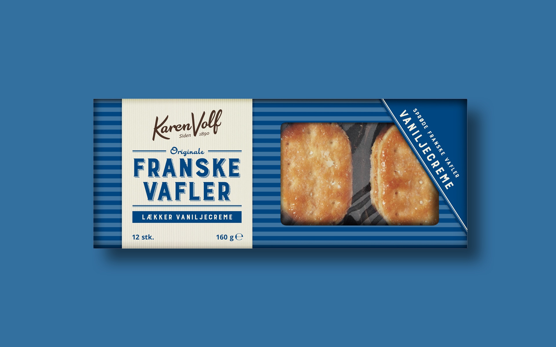
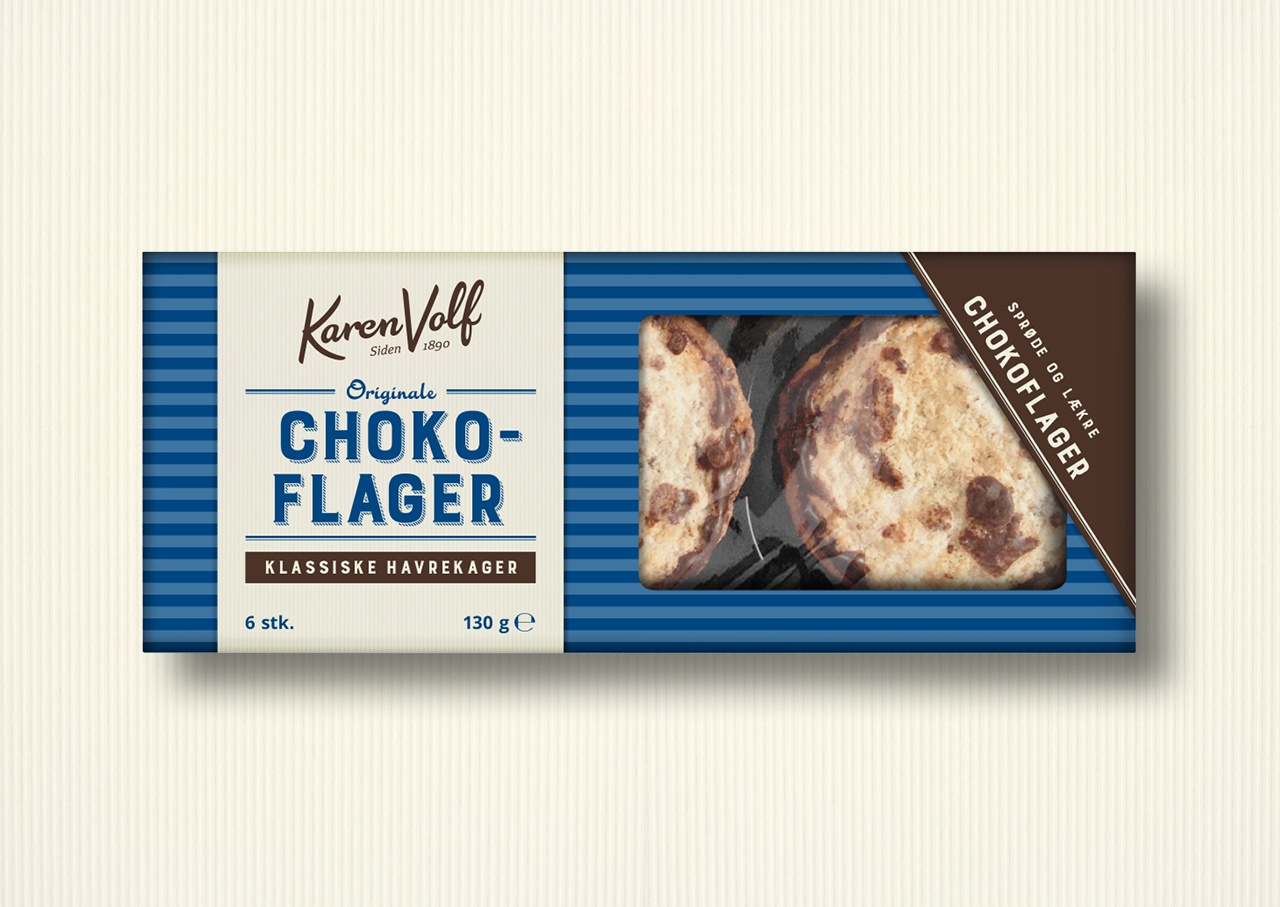
A redesign that fosters history and quality
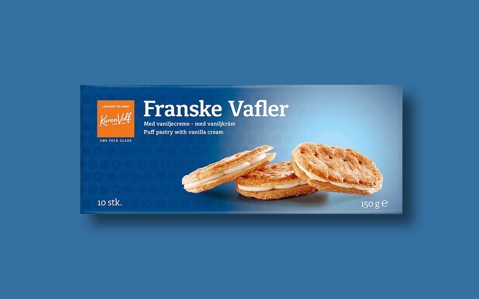
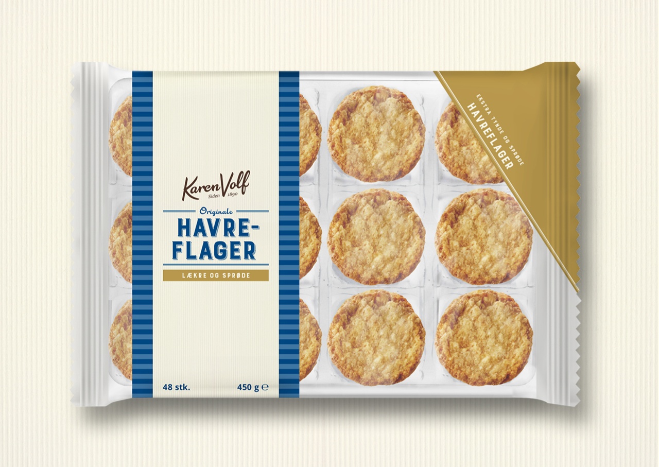
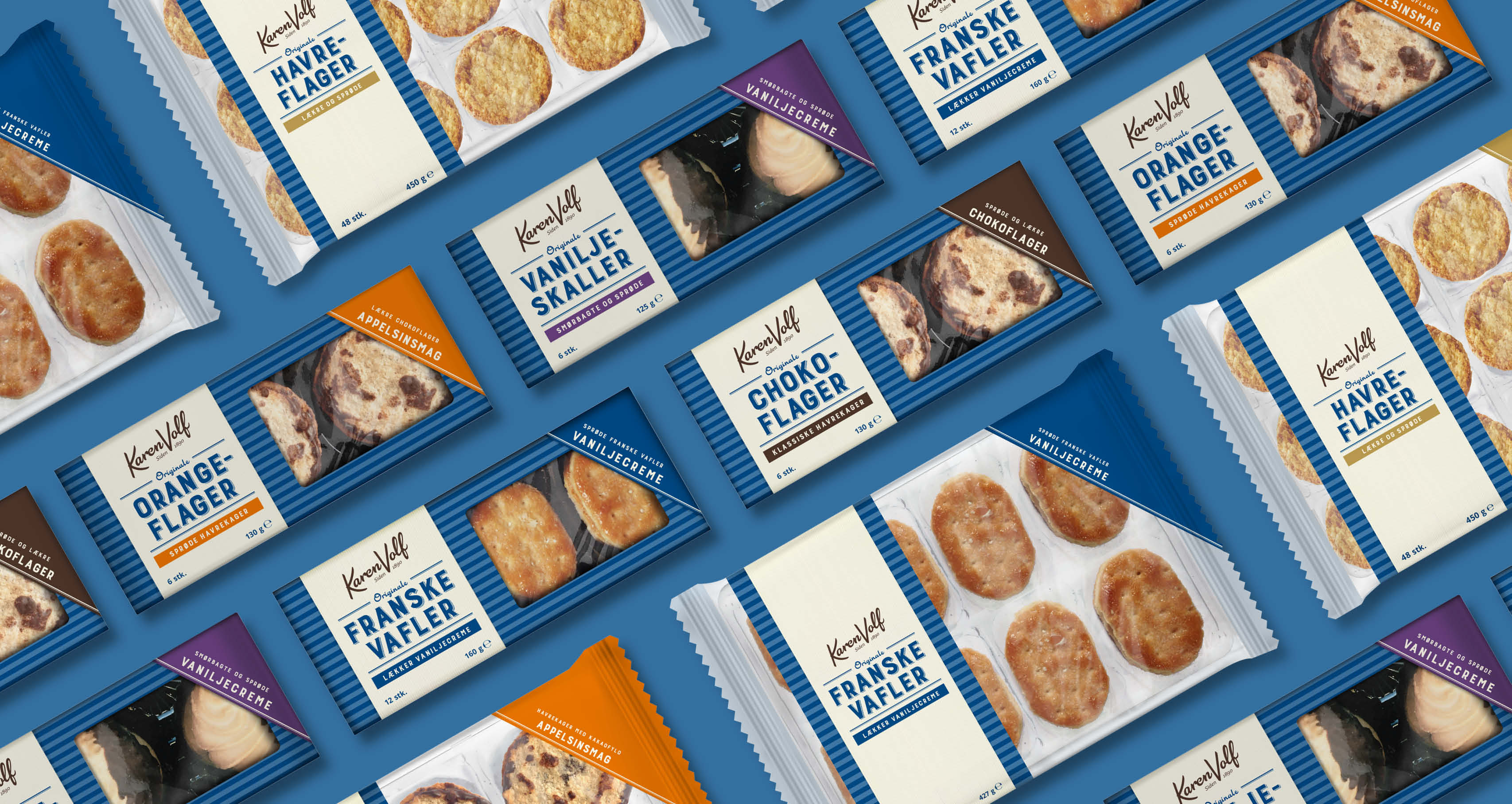
The Danish brand of baked goods Karen Volf has existed since 1890 – known to most in Denmark, the brand and its products are what you would call a Danish classic and favourite. We had the honour of redesigning their Classic Cookies range.
As part of a new strategy Karen Volf decided to return to its roots by going back to some of the original recipes from the old days, emphasizing the focus on quality and tradition. This lines up perfectly with the consumer trend of snacking – the eternal search for snacks, preferably healthy, but if not, the snacks need to be of great quality so that we can properly treat ourselves.
Client
BISCA A/S
Project
Redesigning Karen Volf’s Classic Cookies range
Competences
Packaging design
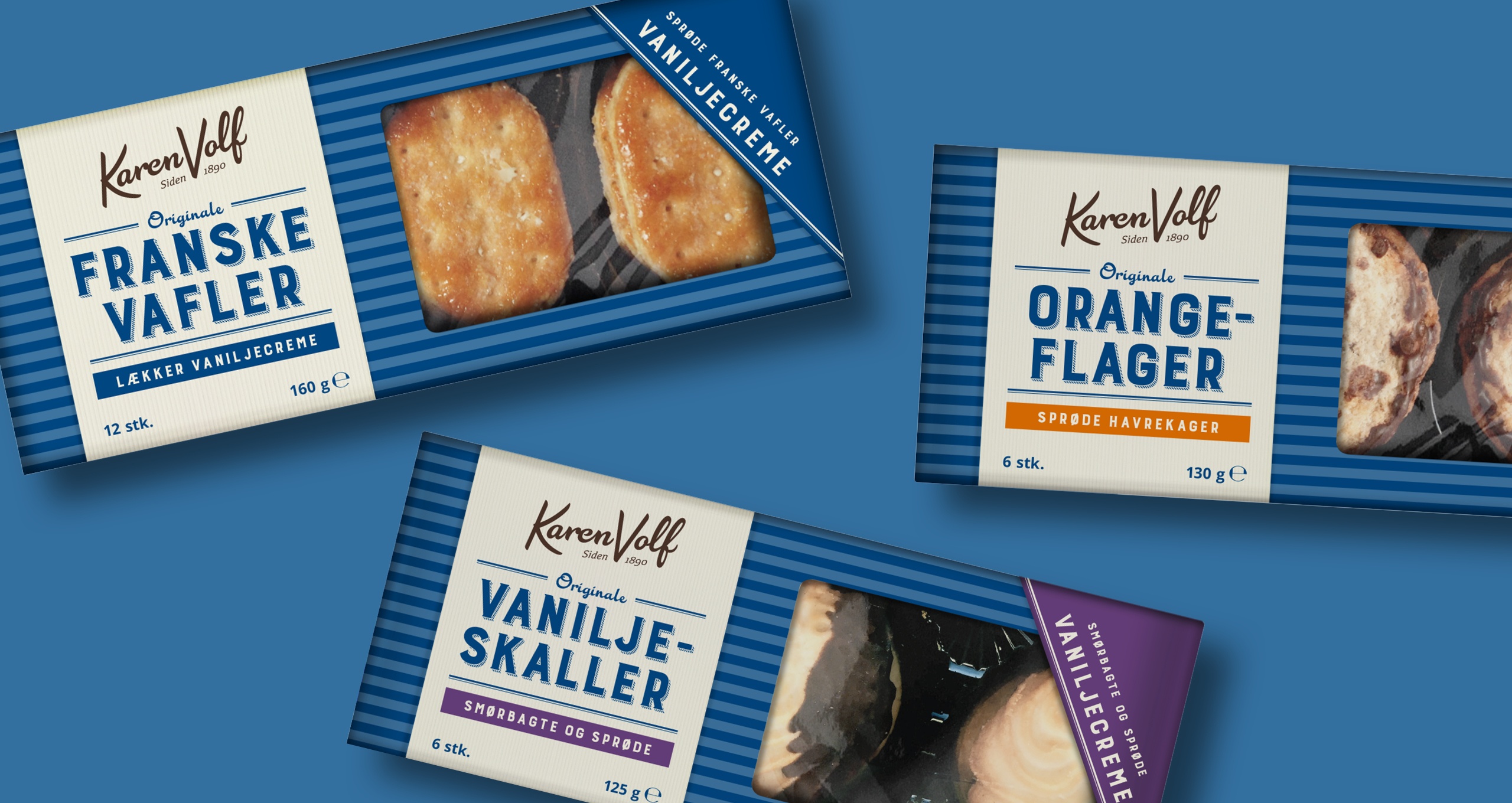
Traditional meets contemporary – and blue to catch the eye
The focus on tradition and quality created a clear path in terms of design, since the packaging had to communicate these values to the consumers. We worked with a classic and authentic expression hinting at the history of the brand, combined with a contemporary look. We used the blue color across all products as a tool to catch the eye of the customer, resulting in efficient shelf impact in stores.
Are you interested in hearing more about how a redesign can enhance the perception of a product’s quality?
Call us at +45 87 310 101
Or write us an email at mark@cameleon.dk

Mark L. Wegeberg,
Managing Director & Contact Manager